
Dashboard for AI Agent
Orby.ai
My Role
Product Designer
customer (nda)
Web App/ AI
Dasnboard
customer (nda)
A Fortune 10 company
SV Large tech company
Tools
Figma
Slack
Notion
Timeline
2023
DesCription
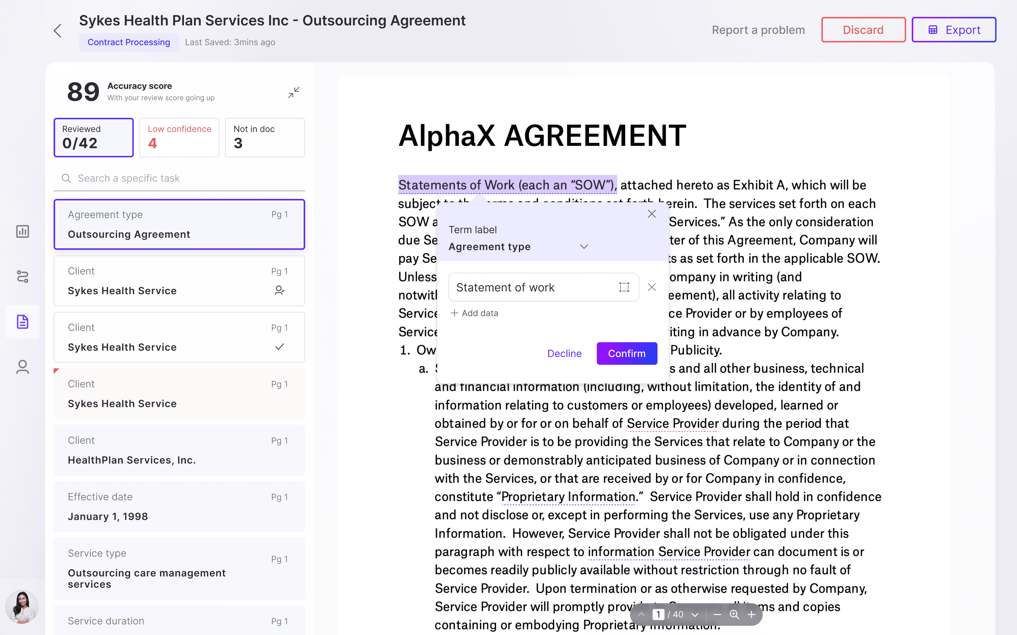
Dashboard for a Document Automation AI agent: enables non-tech users for better task management and trouble shooting.
Context
Orby.ai's AI agents processes vast amounts of data and generate automations for complex enterprise workflows. However, for businesses to adopt and rely on these AI-driven solutions, they need to trust the suggestions and actions proposed by the system.
Due to NDA restrictions, I can only share limited details here. However, I'm eager to discuss the development process and real-world applications of Orby’s work. Contact me to learn more about this transformative project.
background
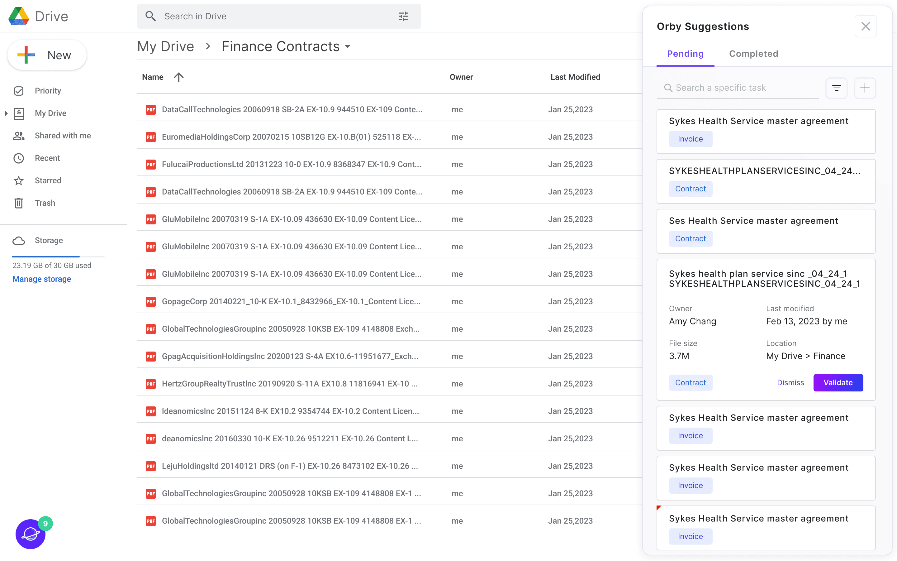
The Document Automation AI Agent need to present data
Orby AI is a web-based AI automation tool to enhance document handling productivity for enterprise clients (details enclosed in my portfolio). It generate automations for complex enterprise workflows. However, for businesses to adopt and rely on these AI-driven solutions, they need to trust the suggestions and actions proposed by the system. A dashboard is need to make two primary users (financial administrators and end users) to monitor the productivity improved, the time saved, and the performance both of the works’ and users’.


challenge
Representing Data for trust building, identifying outliers, and taking actions
Orby.ai processes vast amounts of data to automate workflows. The challenge is to present this data in a way that helps users quickly understand information, spot anomalies, and take appropriate actions. Includes:
Data Visualization
Choosing the most appropriate visualization method based on the type and volume of data being presented;
Interactive Dashboards
Create dashboards that allow users to drill down into data points, revealing more detailed information as needed
Anomaly Highlighting
Automatically highlights statistical outliers and potential issues, drawing user attention to areas that may require action
Solution brief
Understandable data metrics with the ability to drill down

Alert system to help users directly identify problematic metrics


how we got here

business impact
⚖️ Beta version was launched in April 2023
Due to the rapid development and brief usage, we could not gather sufficient user feedback at this time. So instead of tracking the actual outcomes, we established three criteria to evaluate our design:
- Align with client’s mission to bring streamlined no coding document automation experience
- Summarize past performance and monitor current status to improve target users work performance and then reduce the cost
- Identify outliers and risks for quick trouble shooting and refinement leading to better work accuracy and efficiency, as well as improved AI model performance
✅ Updates:
Orby.ai raised $30M in series A round in June 2024.
A 4X ROI was achieved for the project within days.
After implementing Orby AI, the customer was able to increase cost savings and productivity by 85% and speed up processing time by over 70% while simultaneously improving supplier and employee experience.
my contribution
🔑 Aligning Goals
I closely collaborated with developers and product manager, and confirmed real demands from higher stakeholders to ensure an intuitive, accurate and cohesive experience, as well as keep the experience consistent across the AI automation product.
💼 Connecting Design To Business
As a product designer, I designed the dashboard for two target users (financial administrators and end users) to have a sense of the improved productivity, the time they have saved, and monitor their work accuracy and performance. Building this dashboard was important not only to make the product easy to use, but mainly because it was attached to the most important business goal: make the AI product a more trustful and helpful tool.
Main Responsibility :
Management (help with sprint planning, weekly reviews with client)
UX research (interviews, user testing, user story mapping)
Exploring and validating ideas (brainstorming, collect feedback from stakeholders, prioritization)
Design (wire framing, low-fi, hi-fi, prototyping)
kick off
We aligned project scope and confirmed domain knowledge with clients through the kickoff meeting, which enabled us to define the initial challenge for the dashboard.
❇️ Initial Challenge
How might we provide dashboard for financial department to track work and team performance and trouble shoot to ensure data extracting efficiency and accuracy?
understand the domain
🙋🏻 Meet the stakeholders
After conducting the stakeholder interviews, we developed a better understanding towards target users and their related job duties.

Review team performance
Find system issues and seek for solutions from AI service supplier.
Identify outliers to take action.
Financial administrator
I want to find outliers faster to ensure work accuracy and efficiency
I want to know how AI helps the team amd fix problems if there is any.

Review my performance.
Identify term accuracy outliers to pay more attention when extracting data.
Financial operators
I want to make sure my works are accurate
I want to see my performance and how AI helps me
Refine AI model as needed
Solve technical bugs reported by customers.
Orby AI
Provide users visibility of accuracy and provide them a way to contact us to fix problems if there is any.
We want to make users more confident about our product
What's the current work process ?
Who are the dashboard designing for ?

Orby AI
What data to show ?
From the previous research, we learnt that 2 target users have different duties and goals, so they care about different metrics in order to success in their own work.

Financial Administrator

Financial operators

Reframe the problem
How might we represent data to help users understand information, identify outliers and drill down to do research and take action?
understand the market
So...what’s in the market ?

inspirations
3 major strategies to enhance the outcomes
I closely collaborated with developers and product support specialists, and confirmed buy-in from higher stakeholders to ensure an intuitive, accurate and cohesive importing experience, as well as keep the importing experience consistent across the platform
info architecture
To group relevant data could help users scan information at first glance and build mental model.
data visualization
To use data visualization to reveal information and allow users to drill down to do more research.
alert
system
Alert/Insight enables users to quickly pay attention to outliers and take actions
See the design principles
🗂 Intuitive
Users should be able to understand the dashboard quickly and find what they need without too much extra assistance or guidance.
⏱ Easy & Efficient
Users should be able to understand the dashboard quickly and find what they need without too much extra assistance or guidance.
❇️ Understandable & Actionable
Solid evidence and actionable content are both necessity to a good insight. The dashboard should provide both two for users.
Design challenge 1
What is an efficient layout?
During the iteration, we compared 3 versions of layout to present the information according the previous analysis and come up with the final version.
🔀 limit the redirections in user experience
🛠 reduce the difficulty in development
🧠 reduce users cognitive load
Overview
task processed
actions automated(task, term)
hours saved
Orby accuracy score
Term Accuracy (by workflow)
Terms automated
Term accuracy trend
Bottom term accuracy
Drill down to view relevant tasks
Tasks per user
Drill to view tasks completed by users
Time per task
Users Performance (2 * 2 Matrix)
03
All Users
01
Overview
02
All Terms
Design challenge 2
How to visualize complex metrics?
🗓️ Think about the purpose of every data visualization
📊 Mind Data-Ink Radio
💡 Solid evidence and actionable content are both necessity
Term accuracy
*Term Outliers = dramatic change in accuracy / extremely low/high accuracy
v1
v2


❌ how to drill down to related task from low ranking terms?
❌ too space consuming
❌ the chart is too small to see trend details
❌ tasks button is easy to understand but visually repetitious.
❌ need to show different terms trend at the same time
Final

✅ Group all term metrics to improve overall hierarchy.
✅ Show top 5 outliers & able to drill down with further actions.
✅ Show most problematic terms’ trend, and filter by changing rate based on the accuracy need.
Team Members’ Performance
*Performance = amount per week + average processing time

❌ lack scalability for large amount of people.
❌ not easy to understand and compare overall performance of all users.
❌ readability issue when two charts overlay
❌ the horizontal axis is not scalable enough to contain many users
Before
After

✅ Easily compare: 2 Axis for 2 indicators of performance to easily understand.
✅ Scalable: able to fit in many people.
✅ Intuitive: highlight the problematic areas for quick identification.
Design challenge 3
How to identify outliers more efficiently ?
*Outliers :
term-dramatic change in accuracy / extremely low/high accuracy
user-average work amount/ average process time is extremely low/high or fluctuate a lot
v1
Side Panel Slide in

Side Panel Slide in
❌ Dashboard will be compressed
❌ Empty state will be hard to fill out the whole panel
v2
Orby Extension + Pop up

Window pop up by Orby floating button (extension)
❌ Existing features are more for interaction
❌ Not in Phase 1 MVP scope


Final
✅ Use Alert icon which is more common
✅ Light pop up window with minimum content
final solutions
Scenario Jack - Financial Operator

“ I always use my dashboard to identify term outliers and low-scored tasks, which in turn allows me to increase my work efficiency. It's really amazing how much time and effort it saved. “
Task 1
Quickly identify outliers
Key Feature
Real-time alerts automatically detected and notified by the AI system.


Task 2
Key Feature
Effectively diagnose and address issues through term accuracy trend tracking and insights analysis.


Task 3
Review tasks with low accuracy term
Key Feature
Directly review potential problematic tasks of low accuracy terms by drilling down from the term accuracy trend chart.


Scenario Alice - Financial Admin

“ I'm so happy to find important data summary in my dashboard to include in my monthly report. It’s quite convenient to see my team's performance and check their tasks as needed.“
Task 1
Get summary data from key metrics
Key Feature
Know overall work progress and performance at a glance.


Task 2
Find potential team member with low performance
Key Feature
Highlighted zones and average bars to help identify and compare.
Drill down to see outlier’s recent task details.
Takeaway & Reflection
🔬
Keep a clear design scope
Set clear expectations of the delivery and success metrics related to the primary goals from the very beginning.
Help clients/users to find the goal as many of them don’t know what they really want.
🚦
Prioritization matters
Scalability is important and many nice to have features can be added in the feature.
Diverging vs Converging
🚧
Mind the constraints
Dev cost must be taken into considerations including technical constrains, time and budget.
Open source helps to save labors and time.
Next step
🛒 More data collecting
Involve more stakeholders for research, testing for further design iterations.
Keep track and analyze target user behavior data over time to get more feedbacks.
💡 More insights and interactions
Dig deeper into the data to provide users with more insights and reasonable suggestions.
Provide alternate methods of drilling down into specific metrics that can be utilized.
📲 More customization and responsive design
Provides users with the flexibility to personalize their metric display and prioritize which metrics they want to see.
Make the dashboard to be responsive and adaptable, allowing for seamless navigation across different devices.